
Time series analysis is a powerful tool for researchers across disciplines, yet its reliance on programming can pose a challenge for those without coding expertise. This blog demonstrates how AI-driven prompts—executed using the GPT-4o model—can enable researchers to perform simple time series analyses without writing a single line of code, making data insights more accessible.
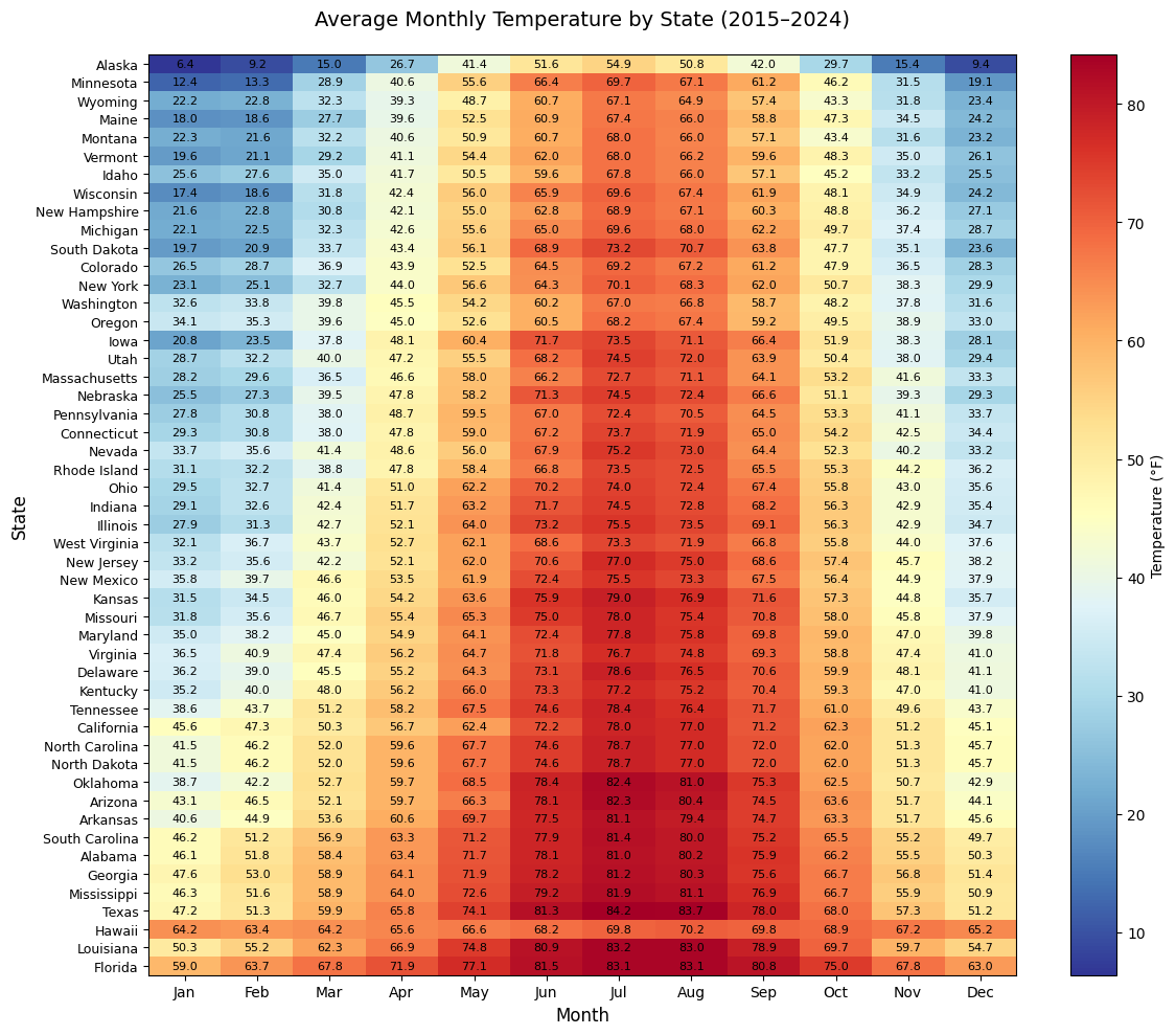
Using a dataset of US state temperatures as a case study, we generated a heatmap that compares average monthly temperatures across states between 2015 and 2024. This task, while typically requiring data wrangling and visualisation scripts, was executed entirely through a concise natural language prompt.
Input file
The data was sourced from the NOAA Climate at a Glance portal. Individual state-level time series were downloaded and merged into a single Excel file containing monthly records for each US state from January 2005 to December 2024. Each row included the date, year, state name, and average temperature in Fahrenheit.
For this analysis, we focused on a subset of the data covering 2015–2024. This period provided a consistent 10-year window for all 50 states, with 120 monthly observations each. The aim was to explore seasonal and geographic temperature patterns using only a natural language prompt.
Prompt
Create a heatmap to visualise the average monthly temperature for each state from 2015 to 2024. Use the filtered dataset by keeping only rows where the Year is between 2015 and 2024 (inclusive).
Since the dataset already contains one row per Year–Month–State combination, you can directly use it to calculate the average monthly temperature for each state.
To do this, group the data by State and Month, and compute the mean of the 'Value' column.
Then, create a matrix where rows are states, columns are months (1 to 12), and values are the average temperatures in Fahrenheit.
Sort the states by their overall average annual temperature (from coldest to warmest) to define the row order in the heatmap.
Generate a heatmap using the 'RdYlBu_r' colour gradient.
Add annotations to show temperature values rounded to 1 decimal place. Include a colour bar labelled 'Temperature (°F)'.
Set the title to 'Average Monthly Temperature by State (2015–2024)' with font size 14 and padding of 20.
Label the axes as 'Month' and 'State' with font size 12.
Set x-axis ticks from 1 to 12 with labels: 'Jan', 'Feb', 'Mar', 'Apr', 'May', 'Jun', 'Jul', 'Aug', 'Sep', 'Oct', 'Nov', 'Dec'. Set the figure size to 12 inches wide and 10 inches tall.
The resulting heatmap should clearly highlight seasonal and regional temperature variations across the United States over the specified period.
Output
The model produced a heatmap that closely resembled a visualisation one would expect from a well-crafted data science script—accurately depicting average monthly temperatures across US states from 2015 to 2024. It maintained key features such as the reversed RdYlBu colour scale, sorted state ordering, and precise annotations.
Recommendation
This demonstration highlights that prompt-based approaches can effectively support basic data analysis workflows, including time series visualisation and trend validation. GenAI tools like GPT-4o offer accessible alternatives to code-heavy methods, particularly for users with limited programming experience. However, we strongly advise using these models with appropriate supervision. While suitable for certain structured tasks—such as data cleaning, exploratory visualisation, or simple natural language processing—GenAI should not be relied upon in methodological contexts where the user lacks sufficient expertise to verify outputs independently.
The authors used GPT-4o [OpenAI (2025), GPT-4o (accessed on 26 March 2025), Large language model (LLM), available at: https://openai.com] to generate the output.