As data visualisation becomes an increasingly integral part of communicating research and insights, the choice of generative AI models capable of handling both code and chart rendering has never been more important. In this post, we explore which models can be reliably used for visual tasks—such as generating Python-based matplotlib charts from prompts—and highlight Claude 3.7 Sonnet, GPT-4o, and GPT-4.5 as the most consistent and capable options currently available. We also provide a sample prompt to help you get started.
Input file
The dataset used in this analysis was sourced from Kaggle and includes detailed information on Nobel Prize winners from 1901 to 2016. It contains variables such as name, gender, birth country, award category, and year of recognition. (For a detailed overview of the data cleaning and preprocessing steps, see this related blog post.)
Prompt
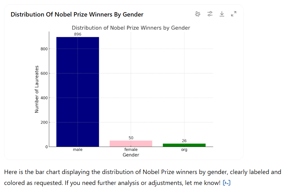
To evaluate the data visualisation capabilities of various GenAI models, we asked them to create a simple bar chart showing the distribution of laureates by gender. The prompt instructed the model to load the data, group winners by the gender column, count the entries, label the axes clearly, add a title, display exact counts above each bar, and colour the bars blue for male, pink for female, and green for other or unspecified categories.
Load the dataset nobel_prize_by_winner_utf8.csv and create a bar chart showing the distribution of Nobel Prize winners by gender. Follow these steps:
- Use the
gendercolumn to group the data and count the number of laureates in each group. - Label the axes clearly:
- X-axis: Gender
- Y-axis: Number of Laureates
- Add a title:
"Distribution of Nobel Prize Winners by Gender" - Display the exact count on top of each bar.
- Colour the bars as follows:
- Male: blue
- Female: pink
- Other / unspecified: green
- Show the chart.
Claude 3.7 Sonnet
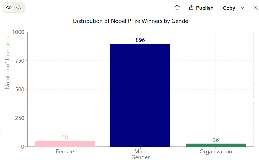
Claude 3.7 Sonnet executed the task accurately, producing a clean and well-labelled bar chart that clearly reflects the gender distribution of Nobel Prize laureates. The colour scheme follows the instructions precisely, with navy blue for male, pink for female, and green for organisations. The exact counts are displayed on top of each bar, which enhances clarity and readability.
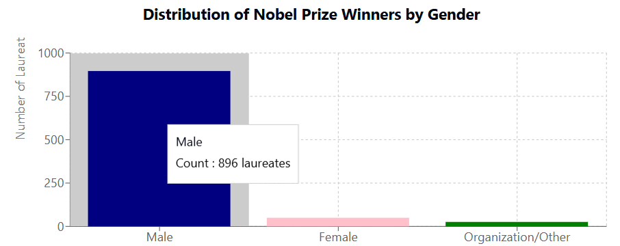
Additionally, the Claude interface supports interactivity: even if explicit count labels are omitted from the prompt, hovering over the bars reveals the corresponding values—making the chart both functional and user-friendly.
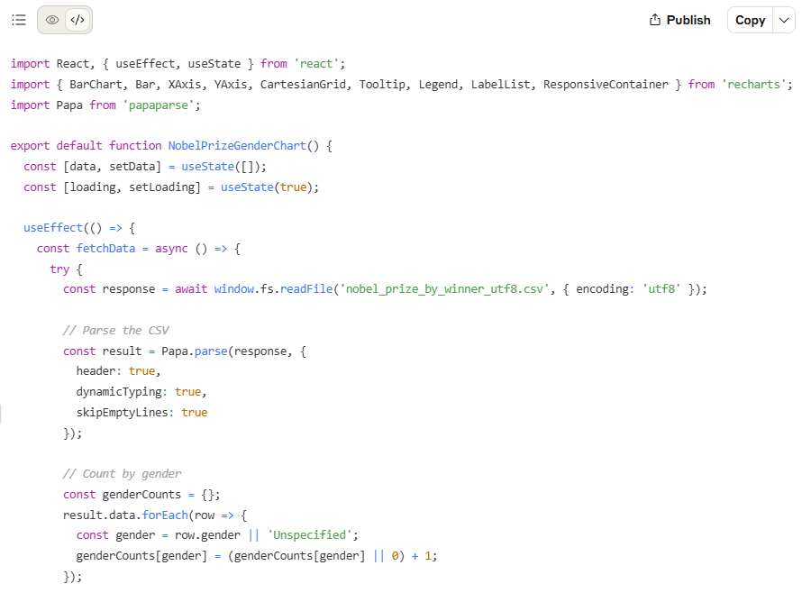
Another advantage of Claude’s interface is that the output can be seamlessly switched to a code view. This feature is handy for developers, as it allows them to copy cleanly formatted code directly or even import it into a .tsv or .js file for further use. Whether for documentation, prototyping, or integration into a larger application, this immediate access to reusable code offers a practical benefit that goes beyond simple visualisation.
GPT-4o and GPT-4.5
Both GPT-4o and GPT-4.5 handled the task flawlessly, producing an identical and accurate bar chart that meets all the prompt specifications. The chart includes clearly labelled axes, correct colour coding (blue for male, pink for female, green for other), and precise count annotations above each bar. Notably, GPT-4o is available for free within certain usage limits, making it an accessible option for users seeking visualisation capabilities without a plus or pro subscription. Given that the output was indistinguishable from that of GPT-4.5, GPT-4o stands out as a strong choice for simple visualisation tasks like this.
Similar to Claude 3.7 Sonnet, the interface is interactive—hovering over each bar reveals the corresponding value—and the chart can be downloaded directly as an image. Users can also modify the colour scheme using built-in style options without needing to regenerate the entire chart, offering added flexibility for customisation and reuse.
Additionally, when the “Always show details” toggle is enabled, GPT-4o and GPT-4.5 display the full code used to generate the chart. While this script cannot be downloaded directly as a file, it can be copied instantly using the built-in "copy" button—making it easy to reuse or adapt the code in a local environment for further development or integration.
The authors used GPT-4.5 [OpenAI (2025) GPT-4.5 (accessed on 14 April 2025), Large language model (LLM), available at: https://openai.com] to generate the output.