
Creating visualisations from raw meteorological data no longer requires programming skills. In this post, we demonstrate how researchers can generate a warming stripes diagram – a simple yet powerful visualisation of long-term temperature trends – using only a natural language prompt. We recommend using GPT-4o or GPT-4.5 for this task, as these models reliably interpret tabular data and generate accurate visual output using Python code. With just a few lines of instruction, you can turn historical temperature records into an informative and visually engaging chart.
Input file
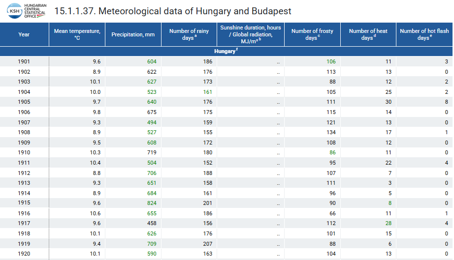
The input file was an .xlsx spreadsheet downloaded from the Hungarian Central Statistical Office (KSH), available at this link. The file contained national-level meteorological indicators, including average annual temperature data for Hungary from 1901 onward.
Prompt
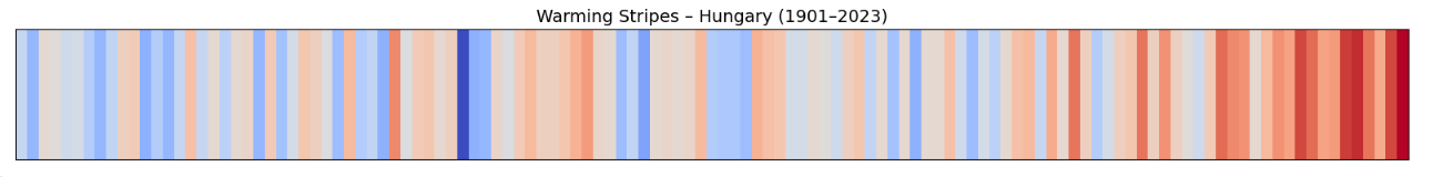
Create a “warming stripes” visualisation using historical average temperature data for Hungary from 1901 to 2023. The input contains two columns: Year and Mean Temperature, where each year corresponds to the annual mean temperature in degrees Celsius.
Each vertical stripe should represent a single year, colour-coded from cooler to warmer using the coolwarm colour map (blue for cooler years, red for warmer years).
The figure should be in landscape format with no y-axis, and only the start year (1901) and end year (2023) shown on the x-axis. Title the chart: "Warming Stripes – Hungary (1901–2023)".
Use Python with pandas and matplotlib, and ensure the figure is tightly laid out and visually clean.
The prompt guided the model to create a warming stripes visual for Hungary between 1901 and 2023, based on annual mean temperature data. The result was a clean, horizontal figure that conveyed climate change trends at a glance – no coding was required.
Output

To generate the warming stripes visual, the model first examined the structure of the Excel file containing historical temperature data. It correctly identified that the first two rows included metadata and that the actual values – years and average temperatures – began from the third row of the spreadsheet. Next, it extracted the relevant columns, containing the year and the corresponding mean annual temperature for Hungary. These values were then cleaned and standardised: the model converted both columns into numeric formats and discarded any rows with missing or invalid entries. This ensured that the dataset was consistent and ready for visualisation.
After cleaning the dataset, the model assigned colours to each year based on the corresponding average temperature, following the standard “warming stripes” convention: cooler years appeared in shades of blue, while warmer years were shown in red. It generated a horizontal visual where each stripe represented a single year from 1901 to 2023. To keep the focus on the trend itself, the figure included no axis labels or gridlines–just the first and last years were marked. The layout was adjusted to minimise whitespace, resulting in a compact, visually striking summary of over a century of temperature change in Hungary.
Script
The result obtained through prompt-based generation was functionally equivalent to the output of a conventional, code-driven workflow. This confirms that the model correctly applied each step of the data preparation and visualisation process.
A full Python-based implementation is available in the accompanying Jupyter notebook here, allowing for direct comparison.
Recommendation
This example demonstrates that GPT-4o can reliably handle essential steps in data cleaning, preprocessing, and visualisation. The model correctly interpreted the structure of a raw Excel file, extracted the relevant columns, standardised the data, and generated a clear and informative warming stripes chart – all based on a natural language prompt. For researchers working with structured datasets, GPT-4o (or GPT-4.5) offers a practical way to automate routine tasks without writing code. Its ability to follow precise instructions makes it a useful tool for exploring data, producing visual outputs, and simplifying technical workflows in an accessible format.
The authors used GPT-4.5 [OpenAI (2025) GPT-4.5 (accessed on 15 April 2025), Large language model (LLM), available at: https://openai.com] to generate the output.