
Gemini 2.0 Flash proves to be a highly effective model for interpreting Python code in educational contexts. This post demonstrates how a concise and well-formulated prompt enables the model to generate clear, step-by-step explanations of a Jupyter Notebook. Its performance suggests that Gemini 2.0 Flash is a practical and accessible solution for supporting code comprehension and lowering the entry barrier to Python in data-driven disciplines.
Input file
The Jupyter Notebook used in this demonstration focuses on basic data exploration and visualisation of clinical variables. It loads a dataset from a CSV file called clinical_data.csv, including patient-level attributes such as age, treatment group, and blood test values.
The notebook walks through common steps in exploratory data analysis using Python libraries such as pandas, matplotlib.pyplot, and seaborn. It covers operations like:
- Loading and inspecting the dataset
- Grouping data by treatment arms
- Creating visual summaries (boxplots, histograms, scatter plots)
- Customising plot aesthetics with titles, axis labels, and colour schemes
This makes the notebook an ideal candidate for testing how well a language model like Gemini 2.0 Flash can explain Python code to users who may be unfamiliar with programming but need to understand and interpret code-based analysis.
Prompt
To evaluate Gemini 2.0 Flash’s ability to support code comprehension, we provided a single, structured prompt instructing the model to walk through a Jupyter Notebook step by step. The focus was on generating plain-English explanations of each code cell, clarifying key functions and methods, and highlighting elements unfamiliar to Python beginners. The goal was to assess whether the model could bridge the gap between reading code and understanding its purpose, particularly in clinical data analysis.
You are a tutor helping a university student who is statistically literate but new to Python and data visualisation in Jupyter.
Explain the following notebook (Clinical_data_plots_RK.ipynb) step by step.
For each code cell, do the following:
- Briefly describe what the code does in plain English
- Explain the purpose of key functions or methods used (e.g.,
sns.boxplot,groupby,plt.title) - Clarify the type of plot or data transformation and why it's used
- Highlight any Python or pandas syntax that might be unfamiliar to beginners
- Summarise what the output or plot shows in one sentence
Avoid deep dives into programming theory – focus on statistical understanding and practical usage.
At the end, summarise the notebook’s overall aim and what kind of insights it provides from the clinical data.
Output
Gemini 2.0 Flash responded with a well-structured, step-by-step walkthrough of the notebook, clearly aligned with the expectations set in the prompt. For each code cell, the model described the logic in plain English, explained key functions and methods, and highlighted Python syntax that may be unfamiliar to beginners—the generated explanations covered both conceptual and visual aspects of the notebook.
The full output generated by Gemini 2.0 Flash is available here:
From the full explanation, we selected two representative examples that show how Gemini 2.0 Flash approaches the task of making Python code more accessible to beginners. These examples reflect the model’s ability to maintain clarity, explain intent, and bridge the gap between syntax and interpretation.
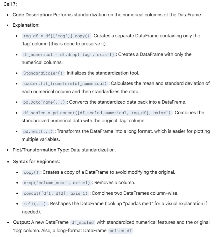
1. Standardising Numerical Features (Cell 7)
This cell involves several steps: separating columns, applying standardisation with StandardScaler, converting the results into a DataFrame, and reshaping the data with melt() for further plotting. The model breaks this process into digestible parts while maintaining the overall logic of the transformation. What's particularly effective is that it anticipates where confusion might arise for newcomers—like the purpose of copy() or the effect of melt()—and provides just enough context to clarify their role without overexplaining. The explanation focuses on why each step is needed, not just what it does, which is essential for genuine understanding.
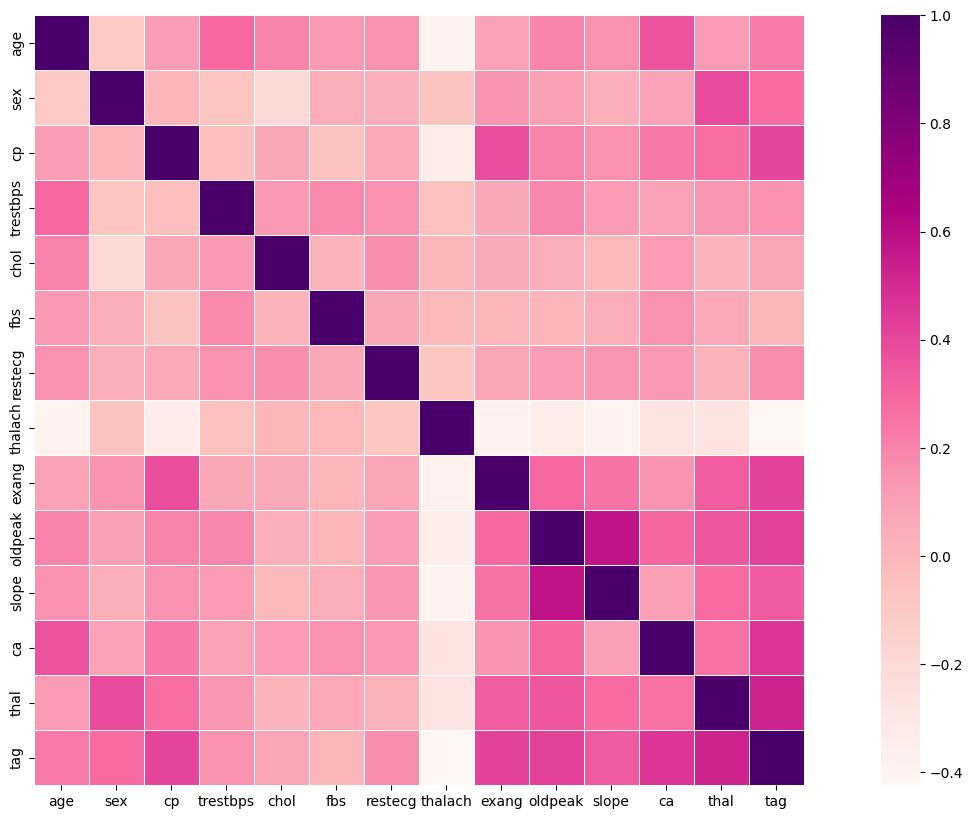
2. Correlation Heatmap (Cell 12)
Here the model explains a standard correlation analysis workflow: converting labels back to numeric, computing the correlation matrix, and visualising it with sns.heatmap(). Rather than merely describing the function calls, the model outlines the statistical reasoning behind them—namely, identifying patterns of association among clinical features.
The value of the explanation lies in how it connects plotting parameters (e.g., colour palette, layout choices) to the goal of readability and interpretability. This helps the reader not only understand the code, but also appreciate the reasoning behind how the visual output is constructed and why it matters in a clinical data context.
Based on the model’s interpretation, the notebook aimed to perform exploratory data analysis (EDA) on a clinical dataset, using visual methods to uncover key patterns. It focused on comparing 'case' and 'control' groups and examining how various clinical measurements related to each other.
The key insights identified through this analysis included:
- Class balance – whether the dataset contained a sufficient and comparable number of samples from both groups.
- Feature distributions – how the values of individual clinical variables were distributed within each group, and how they differed.
- Feature correlations – which variables tended to move together, highlighting potential relationships between clinical indicators.
This summary reflected a clear understanding of the notebook’s analytical goals and showed that the model captured both the structure and the intent behind the code.
Recommendation
This case study suggests that Gemini 2.0 Flash is a practical tool for explaining Python code in educational and learning contexts. Its ability to generate clear, step-by-step explanations from a single prompt makes it useful for teaching, self-study, and onboarding tasks where users may be unfamiliar with programming. The model helps clarify the structure and intent of Jupyter Notebooks, making code-based analysis more accessible. It also shows potential for lightweight code review and documentation, offering concise summaries without requiring advanced prompts or setup. For those working in data-driven fields who need quick and understandable explanations of Python workflows, Gemini 2.0 Flash provides an efficient and accessible solution.
The authors used Gemini 2.0 Flash [Google DeepMind (2025), Gemini 2.0 Flash (accessed on 14 April 2025), Large Language Model (LLM), available at: https://gemini.google.com] to generate the output.